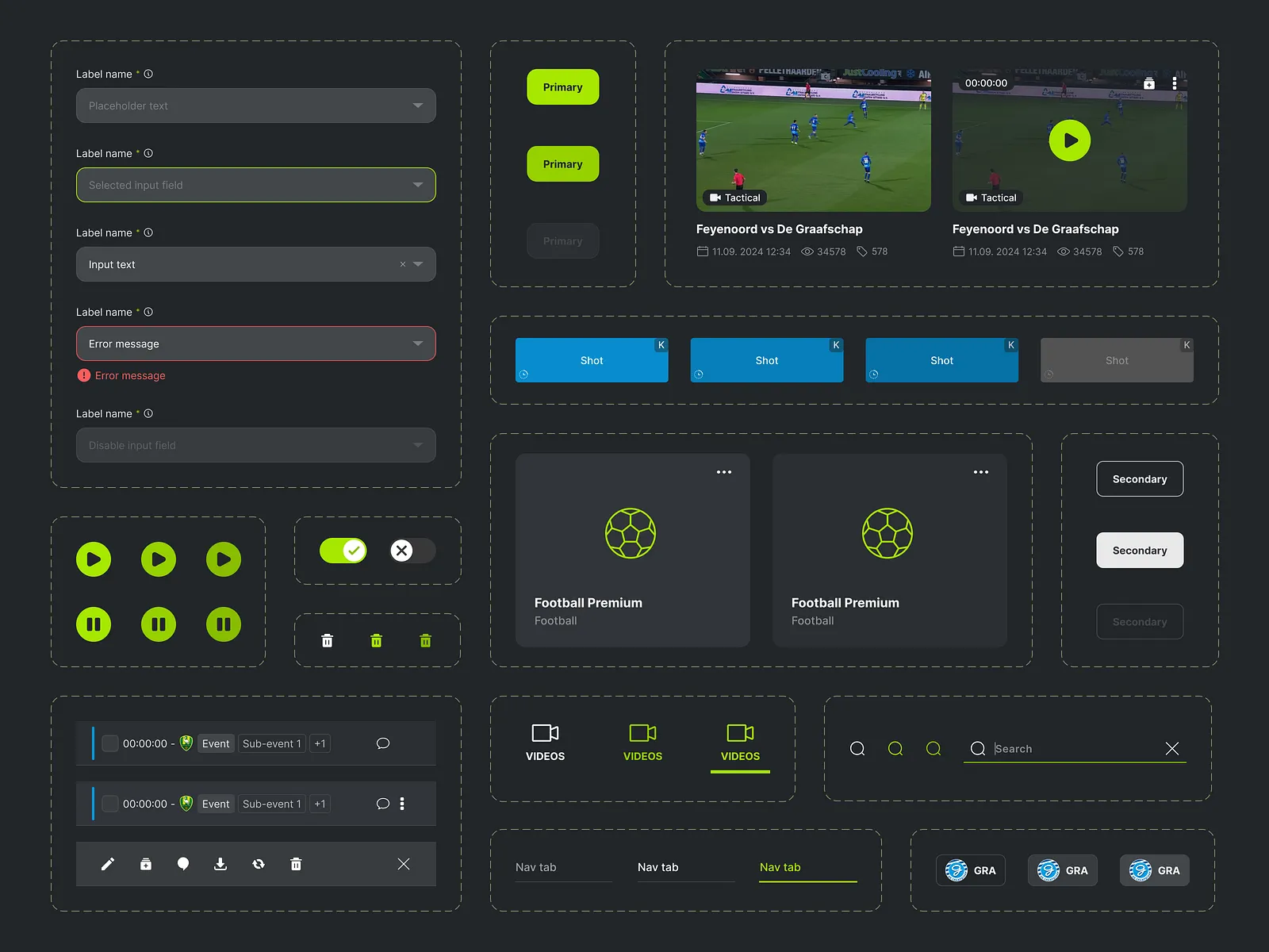
Novu Design System
A component library and design system built for a Series A startup. 60+ components, fully documented.
Overview
Novu hired me to unify their fragmented UI — four different button styles across three products. I built a token-based design system from scratch that now powers their entire product suite.
Problem
Rapid growth meant three separate teams building UI independently. Inconsistency was eroding user trust and slowing down development velocity.
What I Built
- 60+ React components with Storybook documentation
- Design tokens for color, spacing, typography
- Figma component library synced to code
- Contribution guidelines and review process
-
Impact
- 40% reduction in frontend PR review time
- New features shipped 2x faster after adoption
- Zero UI inconsistency issues in post-launch QA